The Legacy of the Peace Symbol
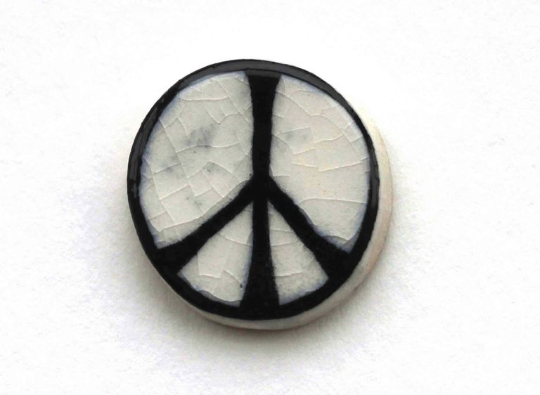
In February 1958 London artist and designer Gerald Holtom designed the icon that is commonly recognized today as the “international peace symbol.” At the time, it was created with specific purpose. Holtom created it for the first Aldermaston March – an anti-nuclear weapons demonstration organized by a committee from the Campaign for Nuclear Disarmament.
Holtom designed the symbol as the letters N and D in semaphore overlaid on top of each other and enclosed in a circle. He is also quoted as drawing inspiration from a gesture of despair: “I was in despair. Deep despair. I drew myself: the representative of an individual in despair, with hands palm out, stretched outwards and downwards in the manner of Goya’s peasant before the firing squad.”

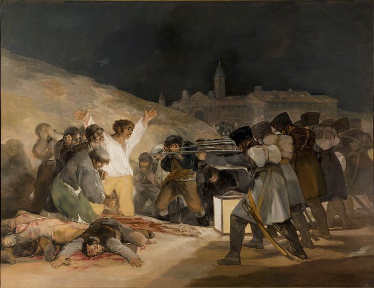
I believe the painting in question is The Third of May 1808 / El tres de mayo de 1808 en Madrid [1814] – an illustration of Spanish resistance against Napoleon’s invasion. But the figure in that painting has his arms outstretched upward; possibly this was a misrecollection on Holtom’s part.
As a designer, I’ve been fascinated by the story of the peace symbol for a long time. It’s simple to draw and recognize—one of the most universally recognized modern symbols in the world, I’d wager, but, as far as I know, most people don’t know its history or original meaning. It was deliberately never copyrighted and consequently gained a life of its own: it expanded beyond the Campaign for Nuclear Disarmament, representing nuclear disarmament at large, anti-war sentiment generally, and has even seen use purely as a cultural symbol. We often think of “hippies” when see a peace symbol, but Holtom also observed, in his own lifetime, the symbol “printed all over fashion garments for the rich.”
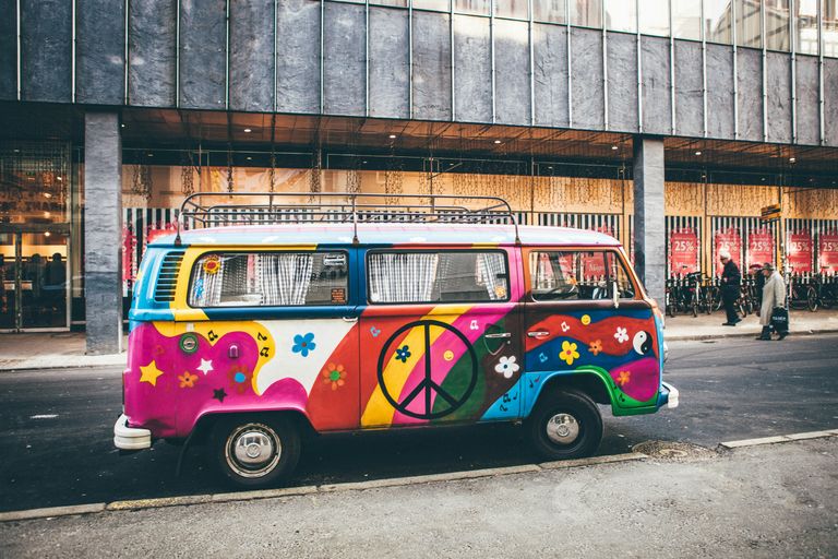
(Bus photo: Nick Karvounis on Unsplash)
I never know what lesson to take away from this history. I’m simultaneously awed by how lack of copyright allowed this little symbol to flourish and become ubiquitous while—one hopes—spreading a message of peace along its way. It’s a beautiful and organic legacy for a designer’s work. On the other hand, it also strikes me as a little sad that something that once had a concrete meaning for a specific movement has become diluted as it aged, sometimes used as just an aesthetic flourish without really saying much at all.
The Campaign for Nuclear Disarmament still exists and is still active, by the way, and they still use the peace symbol as their logo.
Further reading:
- Andrew Rigby, A Peace Symbol’s Origins
- Campaign for Nuclear Disarmament, History of the Symbol